
Few things to remember about Lattice plotting system in R.
- It is an implementation of Trellis graphics.
- Unlike base plotting system, all the plotting and annotations are done by calling a single function.
- They are great for representing multivariate/conditional data.
- xyplot() is the main function in this system. However, like plot() function it lacks the flexibility of creating different plot types.
- While lattice plotting system doesn’t have elegance of ggplot, I must say it’s really easy to learn.
- Margins and spacing are automatically handled.
- Panel functions can be used to control each of the panels.
Let’s learn by examples:
Example 1: Exploring European Stock Indices(Germany DAX , Switzerland SMI, France CAC, and UK FTSE) from 1991-1998 in EuStockMarkets data set. The data are sampled in business time. Let’s visualize it!

xyplot(EuStockMarkets,layout=c(2,2),ylim=c(0,max(EuStockMarkets)))
Note: If you want one single column containing four plots then layout=c(1,4) will do the trick.
Example 2: Visualizing Fuel Economy vs. Performance from mtcars data set.

myfactors <-factor(mtcars$cyl, levels=c(4,6,8), labels=c(“Four”,”Six”,”Eight”))
xyplot(mpg ~ hp | myfactors, layout=c(3,1), data=mtcars,
pch=5,type=c(‘p’,’r’), ## we are combining points and regression type together
par.settings=simpleTheme(col=’brown’,col.line=’blue’),
main=list(label=’Fuel Economy vs. Performance’,cex=2),
xlab=list(label=’Horse Power’,cex=1),
ylab=list(label=’Fuel Economy’,cex=1,col=’red’),
scales=list(cex=.75,col=’green’,alternating=1)) ## change alternating to 2,3,4 to observe what it does
Note: We could have also gone the panel.xyplot(), panel.lmline() route for drawing the regression line.
Example 3: Exploring number of breaks in year during weaving from warpbreaks data set.

histogram( ~ breaks | tension*wool, data = warpbreaks,
type = “density”, border = “transparent”, col.line = “red”,
main= ‘Breaks in Yarn during Weaving’,
xlab = “Type of Wool”,
ylab = “Breaks”,scales=list(alternating=3),
panel = function(x, …) {
panel.histogram(x,col=’yellow’, …)
panel.mathdensity(dmath = dnorm,
args = list(mean=mean(x),sd=sd(x)), …)
} )
Example 4: 3D scatterplot of a mathematical function


x <- seq(-10, 10, 1)
y <- seq(-10, 10, 1)
mytable <- data.frame(expand.grid(x,y))
colnames(mytable) <- c(“x”,”y”)
mytable$z <- (myGrid$x)^2 + (myGrid$y)^2
wireframe(mytable$z ~ mytable$x * mytable$y, xlab=”X”, ylab=”Y”, zlab=”Z”,
main=expression(Z = x^2 + y^2),
shade=T,aspect = c(.8, .8),
light.source = c(-1,-2,3))
cloud(mytable$z ~ mytable$x * mytable$y, xlab=”X”, ylab=”Y”, zlab=”Z”)
Example 5: Drawing Conditional Scatter Plot using airquality data set.
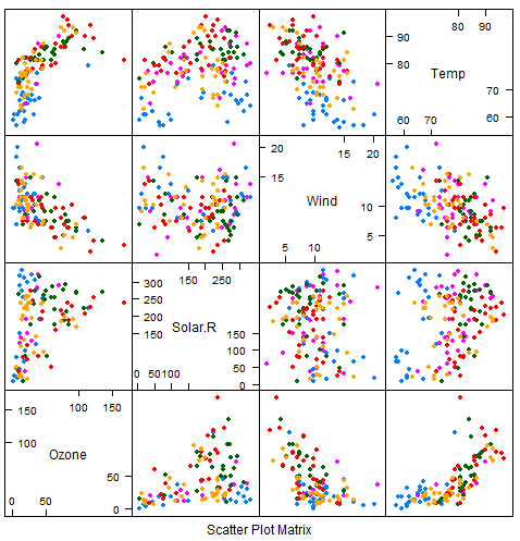
splom(~airquality[1:4],groups=as.factor(Month),data=airquality,pch=20,type=’p’,cex=1)
I highly recommend exploring other functions like levelplot, contourplot, dotplot, stripplot etc.
